
Print mixing fashion tips work best when you treat patterns like ingredients: you need a “base,” a clear flavor profile, and one strong point of contrast. If you’ve ever tried stripes with florals and felt like the outfit wore you, it’s usually not that the combo is “wrong,” it’s that the proportions, colors, or focal point got lost.
Why this matters: print mixing is one of the fastest ways to look styled without buying a whole new wardrobe. But it’s also easy to overdo, especially when shopping trends push loud patterns and you’re left wondering why the mirror feels chaotic.
This guide keeps it practical, you’ll learn quick rules that actually hold up in real closets, a self-check to diagnose what’s “off,” and a few repeatable formulas you can use for work, weekends, and events.
Start with one “anchor” print, then build around it
If you only remember one idea, make it this: pick a single pattern to lead, everything else supports. The anchor can be a skirt, pants, blazer, even a scarf, but it should be the piece you want people to notice first.
Once you choose the anchor, decide what role the second print plays, contrast (to feel bold) or harmony (to feel polished). Many outfits fail because both prints try to be the headline.
- Bold route: anchor print + a clearly different pattern (like stripe + floral).
- Polished route: anchor print + a “quiet” print (like micro-check + subtle stripe).
- Easy shortcut: use a solid in between (printed blazer + solid tee + printed skirt).
Use the “scale rule”: one big pattern, one small pattern
Scale is the hidden reason print mixing feels either intentional or messy. If both patterns are large, the outfit can look loud fast. If both are tiny, everything can blur and read like visual noise.
A reliable pairing is one oversized print and one smaller, tighter print. Think big floral with a thin stripe, or large plaid with a micro dot.
Real-life clue: if you squint and the outfit becomes one busy texture, you probably need more difference in scale, or more solid space.
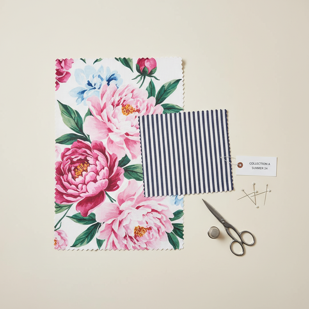
Keep color control: share a palette (even if the prints differ)
People assume print mixing means matching patterns, it’s more about matching color families. When two patterns share at least one color, your brain reads them as related.
Try this simple palette approach:
- Two-color base: pick two main colors (like navy + white), then mix patterns within that limit.
- One “bridge” color: find one color repeated in both prints (black, cream, olive, or a single accent).
- Neutral buffer: add denim, tan, gray, white, or black to calm the look.
According to Pantone, color harmony principles often rely on repeating or balancing hues so combinations feel cohesive. You don’t need to memorize theory, just repeat a color on purpose.
Quick self-check: why your mixed prints feel “off”
Before you buy something new, troubleshoot the outfit in front of you. Most fixes are styling moves, not shopping moves.
- No clear focal point: both prints compete for attention.
- Too similar in scale: two medium patterns often clash more than big + small.
- Palette drift: colors don’t share a bridge shade, so the look splits in half.
- Too many zones: prints on top, bottom, shoes, and bag all at once.
- Wrong “vibe” pairing: graphic high-contrast prints can fight with soft romantic florals.
If you identify one issue, fix just that first. People overcorrect by changing five things and never learn what actually helped.
Wearable formulas you can repeat (work, weekend, event)
These are the print combos that usually survive real-world lighting, photos, and “I’m running late” mornings. Use them as templates, then swap pieces.
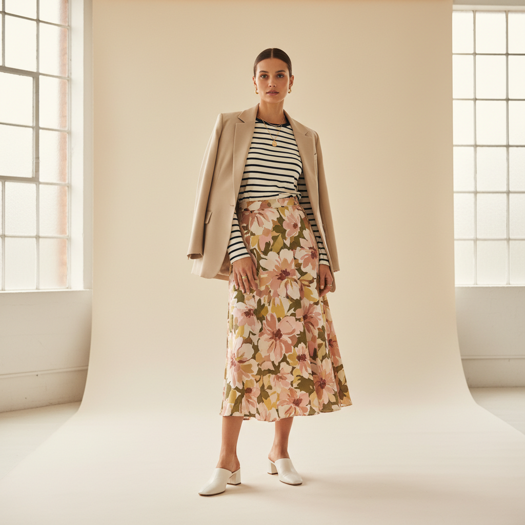
Formula A: Stripes + floral (the classic for a reason)
- Pick a stripe that matches a color inside the floral
- Keep one piece more fitted, one more relaxed to avoid bulk
- Add simple shoes and a solid bag
Formula B: Plaid + animal print (surprisingly neutral)
- Let the animal print be smaller (belt, flats, bag) if you’re new to it
- Use black, camel, or cream to connect the look
Formula C: Polka dots + stripes (clean, graphic, office-friendly)
- Choose dots in the same color family as the stripe
- Keep the rest minimal: one metal tone, one structured layer
Formula D: Same print, different scale (low-risk, high pay-off)
- Example: micro-check shirt with a larger check blazer
- Works best when colors are very close (navy-on-navy, black-on-white)
A practical table: which print combos feel easiest vs. hardest
Not every mix has the same learning curve. If you want fast wins, start with the “easiest” column and work outward.
| Difficulty | Mix | Why it works (or not) | Best for |
|---|---|---|---|
| Easiest | Stripe + floral | Clear contrast in geometry, easy to share a color | Casual to smart-casual |
| Easiest | Dots + stripes | Both read “graphic,” often looks polished | Office, travel outfits |
| Medium | Plaid + animal | Animal print can act like a neutral, but contrast matters | Fall/winter styling |
| Medium | Floral + floral | Needs strong scale difference or a tight palette | Events, creative looks |
| Hardest | Two bold graphics | Competing focal points, can look costume-y fast | Editorial, statement outfits |
When in doubt, pick one “hard” print and pair it with an “easy” one, then add a neutral layer. That’s the difference between playful and stressful.
Common mistakes that make print mixing look accidental
Most people don’t fail at print mixing because they lack taste, they fail because they skip the boring parts: spacing, proportion, and finishing.
- Adding a third print too soon: master two patterns before stacking more.
- Forgetting solids: solid shoes, belt, or outerwear creates breathing room.
- Ignoring fabric weight: a heavy tweed plaid with a flimsy satin print can feel mismatched.
- Over-accessorizing: if the outfit is loud, jewelry should be quieter.
- Same contrast level: two high-contrast prints can clash even when colors match.
Key point: “More confident” usually means fewer competing details, not more patterns.
Practical steps to style mixed prints in 10 minutes
If you want a quick routine you can repeat, use this order. It prevents the classic mistake of building a look that only works in theory.
- Pick your anchor print and put it on first.
- Add a second print with a different scale.
- Check color bridging: find one shared shade, then echo it with shoes or a bag.
- Add one solid layer or solid accessory to create visual rest.
- Do the squint test, then take a quick photo, cameras reveal imbalance faster than mirrors.
These print mixing fashion tips sound simple, but the photo step is where most outfits “click,” especially if you’re dressing for work events or travel photos.
When it helps to get outside input
If you’re consistently stuck, it might not be the patterns, it might be fit, proportion, or comfort. A tailor can help if pieces pull or bunch, and a stylist or knowledgeable store associate can help you see what silhouettes flatter you.
If shopping triggers anxiety or body-image stress, it can be worth talking with a mental health professional, many people underestimate how personal getting dressed can feel, and support is a reasonable option.
Conclusion: make mixed prints feel like “you,” not a challenge
Print mixing gets easier when you stop chasing random “cool” combos and start using a repeatable system: anchor print, different scale, shared color, plus one neutral break. Pick one formula this week and wear it twice, you’ll learn more from repetition than from overthinking.
Action idea: choose one printed piece you already own, then build two outfits around it using these print mixing fashion tips, one with a stripe and one with dots, take photos and keep the better one as your go-to template.
FAQ
How do I mix prints without looking too busy?
Limit yourself to two patterns, make sure they differ in scale, and add at least one solid item. “Busy” usually means there’s no visual rest.
What are the easiest patterns to start mixing for beginners?
Stripes, polka dots, and subtle plaids are forgiving because they read as structured. Pair them with a softer print like floral for a balanced look.
Can I mix prints if I only wear neutrals?
Yes, and it often looks expensive. Black-and-white or navy-and-cream print mixes are easier because color harmony is already built in.
Do my shoes and bag need to match when mixing patterns?
They don’t need to match each other, but they should calm the outfit. Solid shoes and a solid bag are a safe default when you’re wearing two prints.
How many prints can I wear at once?
Two is the most reliable for everyday outfits. Three can work if one is very small or acts like a texture, and you keep the color palette tight.
Is mixing prints appropriate for an office setting?
Often, yes, if the colors are contained and the silhouettes are classic. Think stripe + dot in navy/white, then finish with a solid blazer.
What if my prints share no colors at all?
You can still make it work, but it’s harder. Add a bridging piece in a neutral tone, or choose accessories that introduce one shared shade to connect both prints.
If you’re trying to build outfits faster, a simple approach is to collect a few “connector” basics, a neutral blazer, clean sneakers or loafers, a solid bag, and a belt, then rotate printed tops and bottoms without reinventing the wheel every morning.